
When AI tools started generating websites from text prompts, most designers I know had the same reaction: interesting technically, but not particularly relevant to what we do. A generated site is by definition generic, and generic is close to the opposite of what design work is supposed to produce.
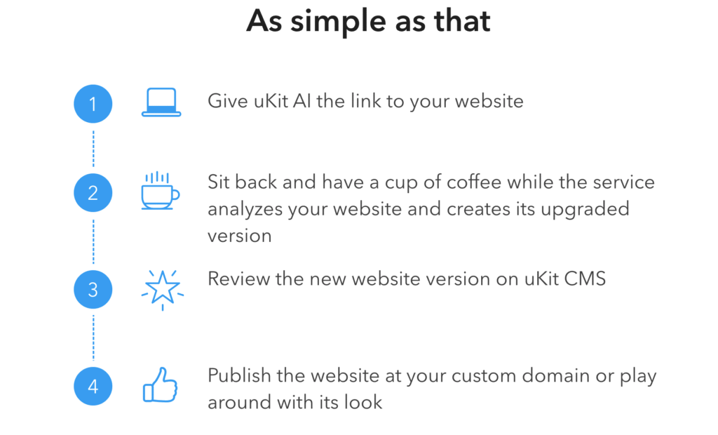
Then a different category emerged. Not tools that generate from nothing, but tools that upgrade from something existing. uKit AI is a concrete example: give it a URL to an outdated website, and it produces a modernized version in about ten minutes – same content, updated layout, mobile-responsive behavior, HTTPS, cleaner code. No prompts about brand direction or target audience. Just an existing site, processed and presented according to current conventions.
This is worth studying even if you never use it in a client project. What these tools do and do not do reveals something specific and useful about the nature of design work – and about where human judgment remains not just useful but irreplaceable.
The Gap Between Dated and Broken Is Mostly Defaults
The first thing that stands out when you look at AI-upgraded sites is how dramatically better they appear without any content change. Same text, same service descriptions, same business – but a mobile-responsive layout, consistent spacing, readable type hierarchy, and modern visual conventions make the whole thing look like a completely different organization built it.
What this tells you is that much of what we call “outdated” is really just “running on old defaults.” The design vocabulary of a site built in 2013 reflects what was standard in 2013 – column grids of a certain density, navigation patterns built around desktop mice, font choices that predate the web typography options available today. Swapping those defaults for current ones produces something that reads as modern, even when nothing about the brand, the message, or the content has changed.
This is both the strength and the limit of what AI redesign tools do. They are good at default replacement. They apply current norms reliably and quickly. What they cannot do is determine whether current norms are right for this brand in this market for these visitors – because that determination requires knowing something about the brand, the market, and the visitors, which is context no URL provides.
Layout Logic Is More Legible Than We Think
One of the more interesting things AI redesign tools reveal is how much underlying logic already exists in most old sites – buried under the visual problems. When the AI strips away the density and dated conventions, what appears is often a structure that was sound all along: information organized in a sequence that makes sense, sections that correspond to real visitor needs, a navigation path that reflects how the business actually works.
The original layouts were not usually wrong about sequence. They were wrong about presentation. The AI corrects the presentation and the underlying logic becomes visible.
For designers, this surfaces a useful distinction: layout clarity is not the same as visual interest. A site can be well-organized and visually flat. It can be visually striking and structurally confusing. The AI upgrade tends to produce the first – organized, current, navigable, but without visual energy or specificity. The work of design, in many cases, is producing the second – something that is all of the above and also feels like something.
Content Quality Does Not Transform With Presentation
This is the limitation that matters most practically. AI upgrade tools carry existing text into the new layout without touching it. Generic service descriptions, vague about pages, copy that could belong to any company in the category – all of it survives the upgrade visually intact and looking more finished than it did before.
This creates a specific kind of problem that is worth flagging for clients considering these tools: a polished layout gives weak content more authority than it deserves. A vague promise looks more credible in a well-designed frame. That is not inherently bad – but it does mean that the review step after any AI upgrade needs to include a content audit, not just a visual sign-off.
For design practices that also handle copywriting or content strategy, this is a clean argument for the value of that work. Visual presentation can amplify a message. It cannot manufacture one. If the client’s site has been saying the wrong things cleanly, the upgrade makes that problem look more confident and polished, which is arguably worse than looking outdated and weak.
Speed Changes the Conversation, Not the Result
The most practically useful aspect of AI redesign tools is not the quality of the output – it is the speed at which they produce something concrete for people to react to. Design briefs are abstract. A rendered, functional draft is specific. The gap between those two things, in terms of how useful a design conversation can be, is significant.
Clients who struggle to articulate what “modern” or “professional” means in words can usually point at an AI draft and say: like this, but more authoritative – or more energetic – or more focused on the services page rather than the homepage. That is a more productive starting point for design work than trying to align on a brief before any visual exists.
This is not AI replacing design work. It is AI compressing the gap between nothing and something-to-react-to, which shortens the feedback loop in a way that benefits the design process. Whether you use this formally in a workflow or just keep it in mind as a reference-generation option, it is a genuinely useful capability.
The comparison question – how well does this tool suit specific client contexts versus alternatives – is actually a useful design thinking exercise in itself. When clients ask about the tools you recommend for their own site management or research after a project is complete, the same evaluative thinking applies. The analysis of what makes one survey or form tool better suited than another for a given context, like the kind of comparison in SurveyNinja vs Google Forms, applies the same design-thinking lens to a different category of tool – and it is the kind of informed recommendation that builds client trust past the initial project.
The Limits Are More Revealing Than the Capabilities
Watching what AI redesign tools do not do is as instructive as watching what they do. They do not make brand decisions. They do not choose which visual elements should carry the most weight. They do not know whether a particular client needs to communicate authority or warmth, precision or creativity. They apply conventions. They do not interpret.
Interpretation is the core of design work. You can learn the conventions – and a good designer should know the conventions in detail, because you cannot make meaningful departures from defaults you do not understand. But knowing conventions and knowing when and how to break them for a specific purpose are different skills. The second one is what AI tools have no mechanism to develop.
Where This Leaves Design as a Discipline
One way to think about the emergence of AI redesign tools is that they are automating the conventions layer of web design with increasing reliability. Tasks that used to take designer time – making a site responsive, implementing HTTPS, updating outdated markup, applying consistent spacing – are now compressible to minutes.
If that layer gets faster and cheaper to handle, the premium shifts toward what sits above it: the judgment about which conventions apply, which should be departed from, and why. The brand thinking, the audience understanding, the structural decisions that determine whether a site does more than look current.
This is a shift, not a replacement. But it does mean that designers whose value proposition is primarily execution – building out what others have already decided – face a different competitive landscape than those whose value is the decision-making itself. The work that gets harder to commoditize is the work that requires knowing the business, the audience, and the context well enough to make choices that cannot be inferred from a URL.
A Practical Way to Use This Understanding
Whether or not you incorporate AI redesign tools into your actual workflow, the analytical frame they force is useful. Before any redesign project, it is worth asking: what problems here are defaults problems – technical debt, outdated conventions, poor mobile behavior – and what problems are interpretation problems – wrong message, unclear positioning, structure that does not serve the actual visitor journey?
The first category can be addressed quickly and relatively cheaply. The second requires more time and more involvement from someone who understands what the site is supposed to do and for whom. Knowing which problem you are actually solving changes the scope, the brief, and the honest conversation about what the result will be.
Summary
AI-powered website upgrades are not a threat to design work – they are a lens that makes the nature of design work clearer. They handle defaults reliably. They cannot interpret. They produce current, competent sites that are not specific to any particular brand or audience. The work of design – choosing what is appropriate, what to emphasize, what to depart from and why – is entirely outside what these tools do. Understanding that boundary precisely is useful both for how you position your own work and for how you advise clients who are evaluating their options.